Home
Paylynx
Fintech / Corporate Finance
Paylynx is a fintech product concept focused on simple and transparent financial management. The project explores how interface design can make complex financial processes feel clearer, calmer, and more approachable for users. In this project, I worked on the product’s visual and interface design, focusing on structure, clarity, and ease of interaction across key screens. The goal was to reduce friction in everyday financial tasks and present data in a way that feels understandable, controlled, and trustworthy.
Project Task
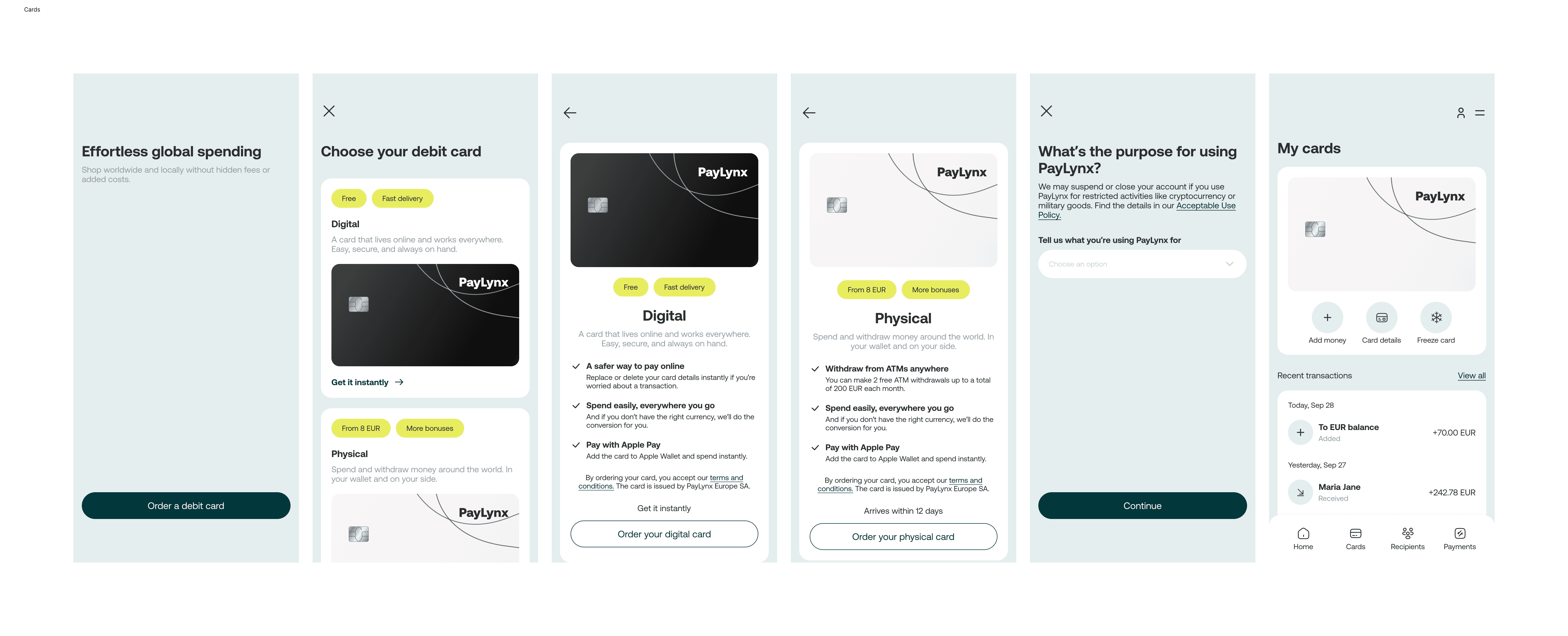
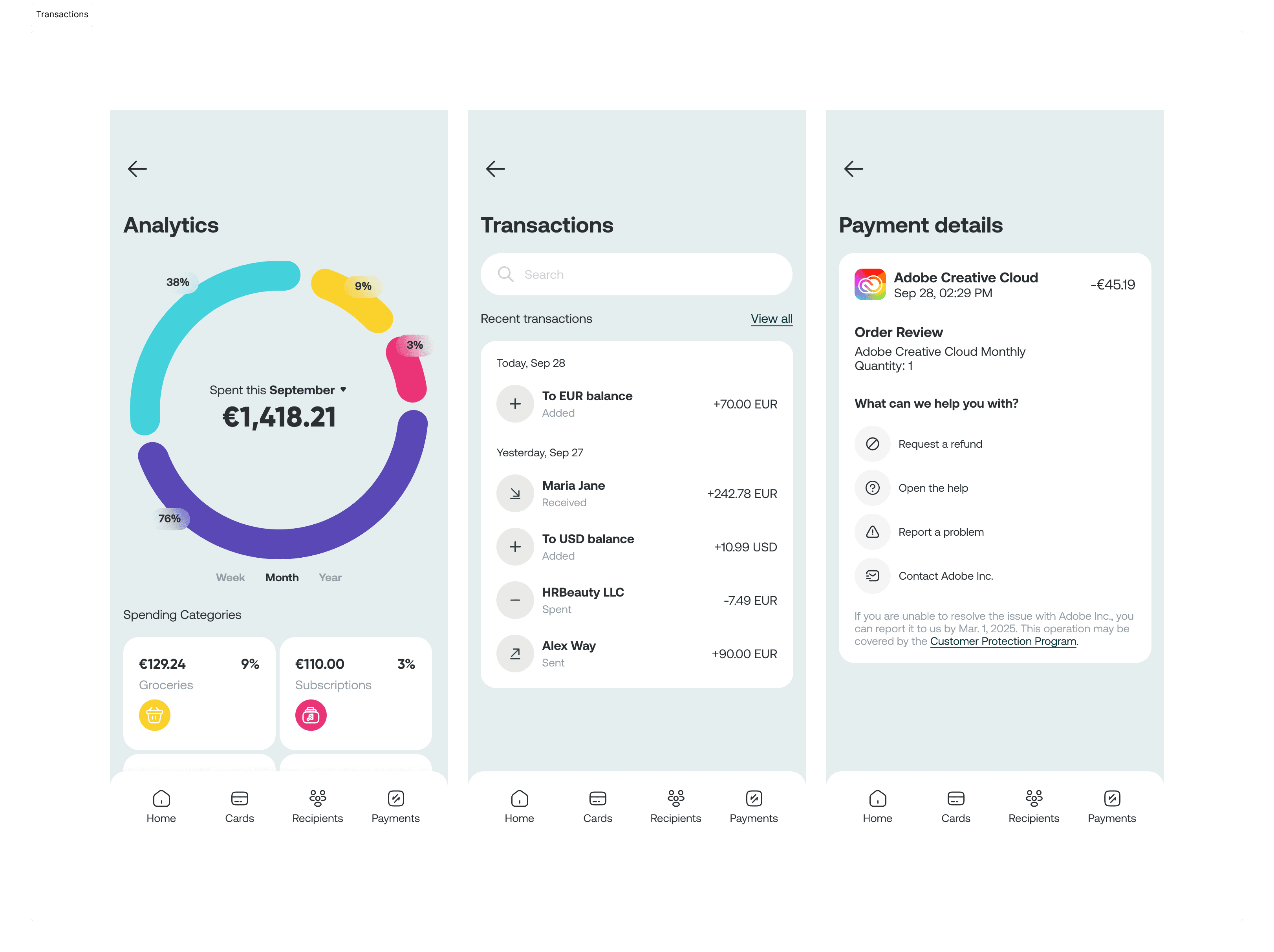
Design a fintech interface that: • presents financial information in a clear and structured way • helps users quickly understand their balance, income, and transactions • supports everyday actions such as transfers and scanning • feels reliable without being visually heavy • balances functionality with a modern, friendly UI The product needed to communicate control and confidence, while avoiding the cold or overwhelming feeling often associated with finance apps.
Solution
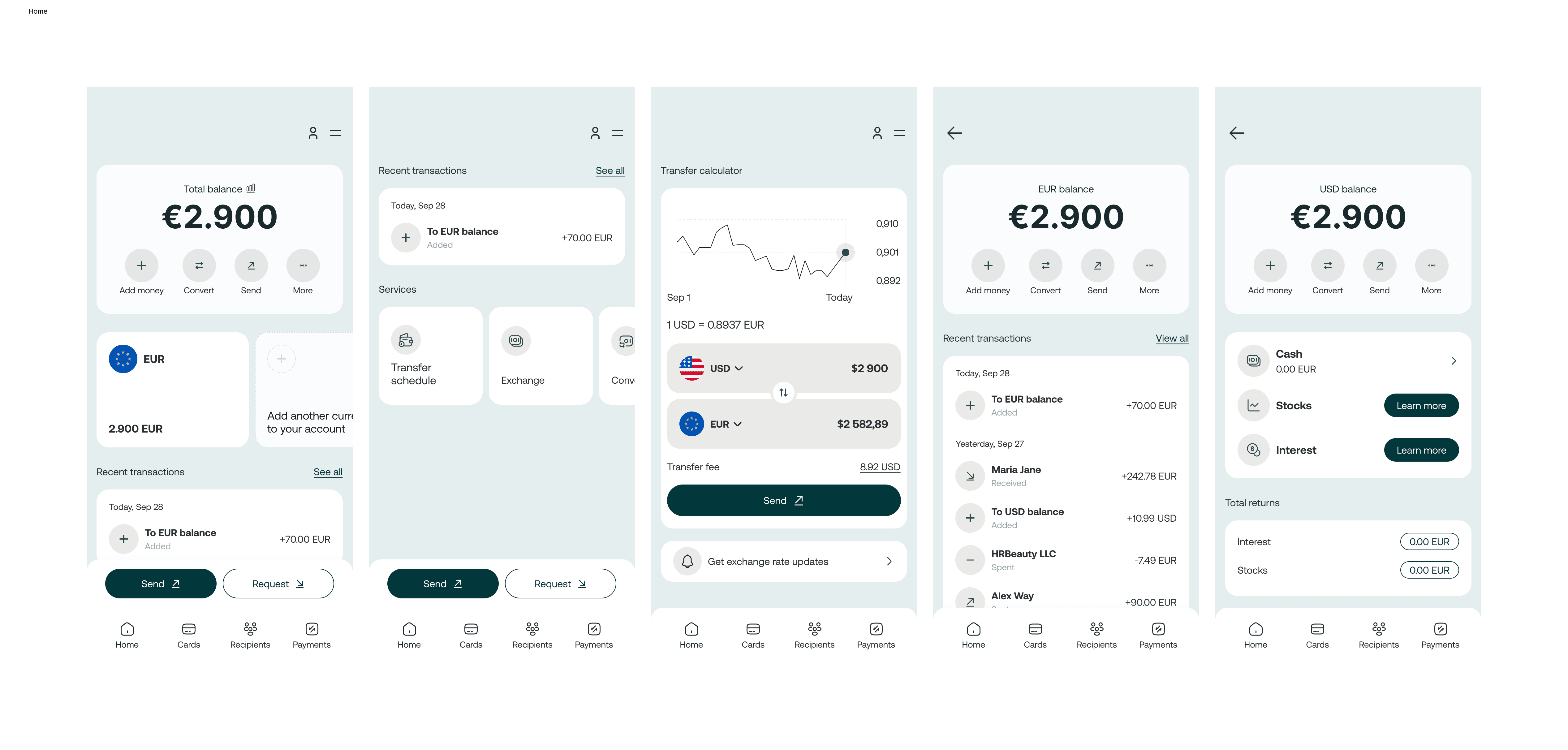
The design focuses on clarity, structure, and visual balance. A clean layout and strong hierarchy help users instantly understand the most important information, such as income, balance, and recent transactions. Key actions are placed prominently and remain easy to access without competing for attention. Typography was chosen to ensure high readability, especially for numbers and financial data. Clear letterforms and consistent spacing help reduce cognitive load and make scanning information effortless. The color palette combines light backgrounds with soft accent tones to highlight key values and actions. Accents are used sparingly to guide attention, while neutral surfaces keep the interface calm and focused. Rounded elements and smooth UI components soften the overall experience, making financial interactions feel less rigid and more human. The interface supports confident decision-making without unnecessary complexity.
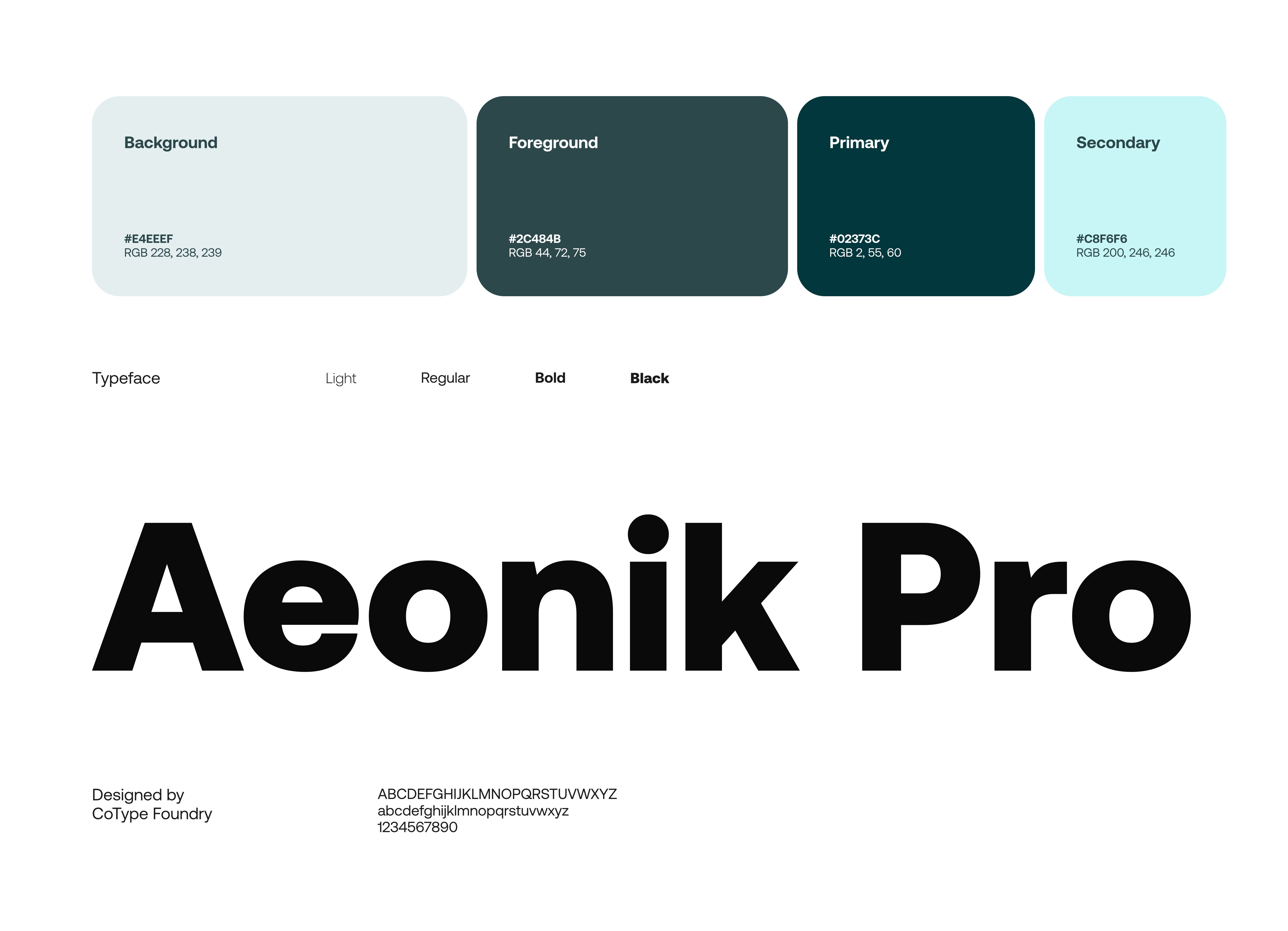
Colors & Typography
The colors and fonts reinforce the app’s brand identity, ensuring clarity and a pleasant visual experience.

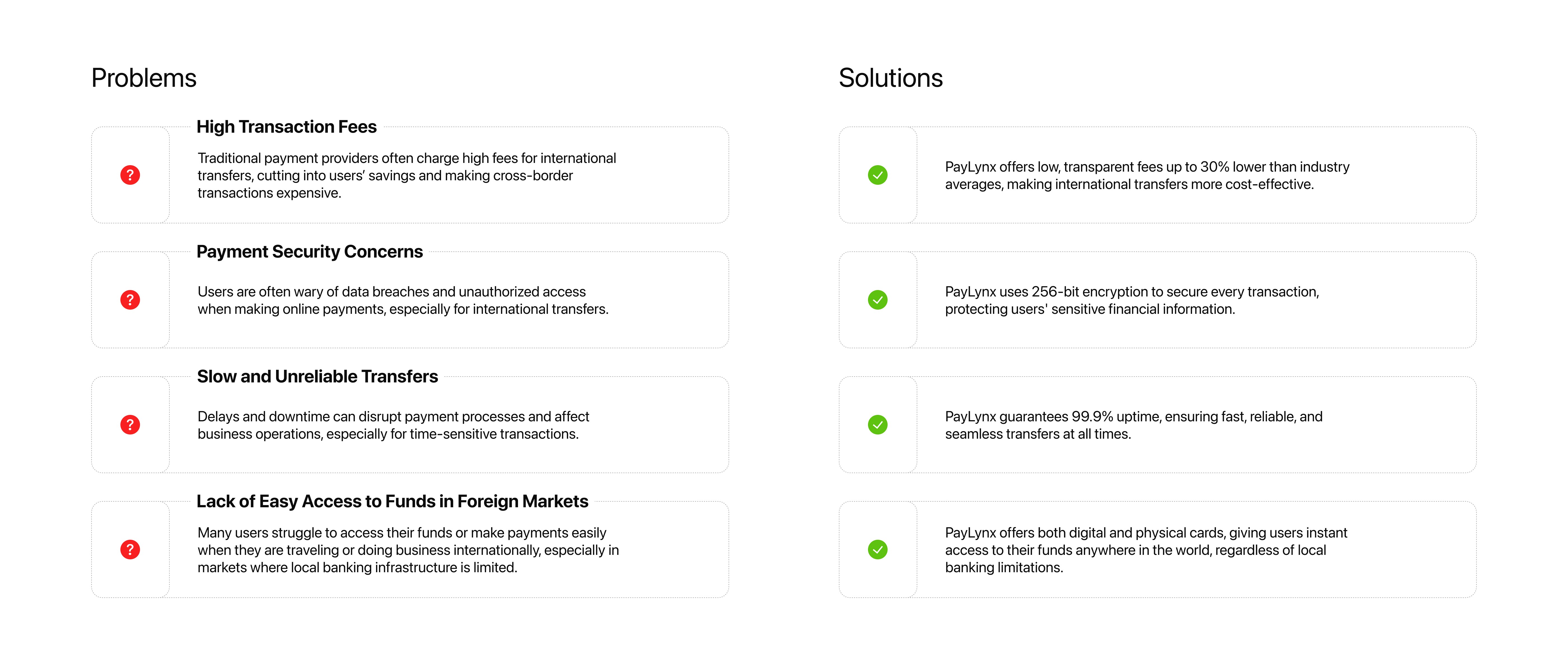
Problems & Solutions
Identifying challenges and their solutions
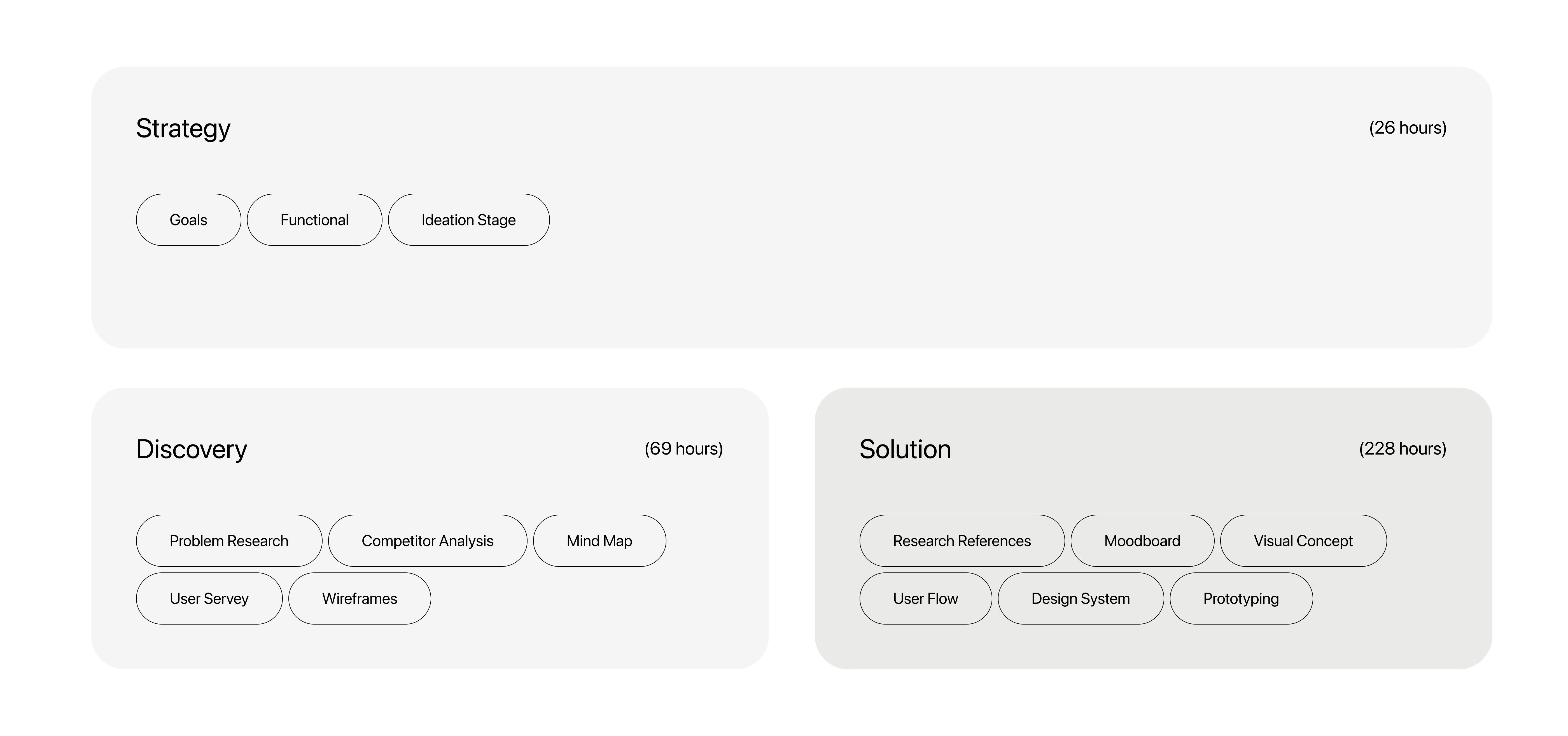
Project Timeline
Visualizing the journey of PayLynx
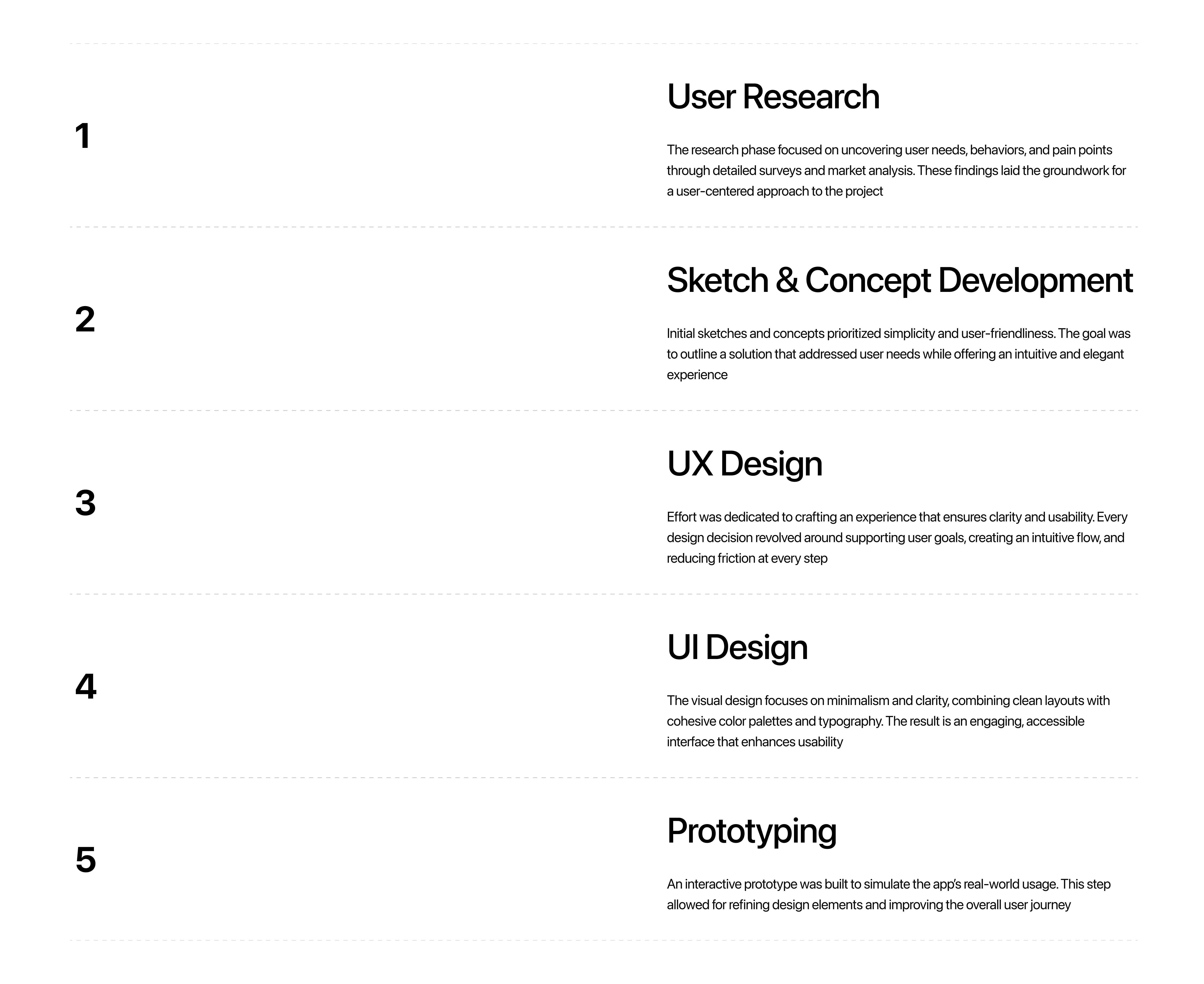
Design Process
Begin by conducting thorough research to understand user needs, market trends, and competitor offerings
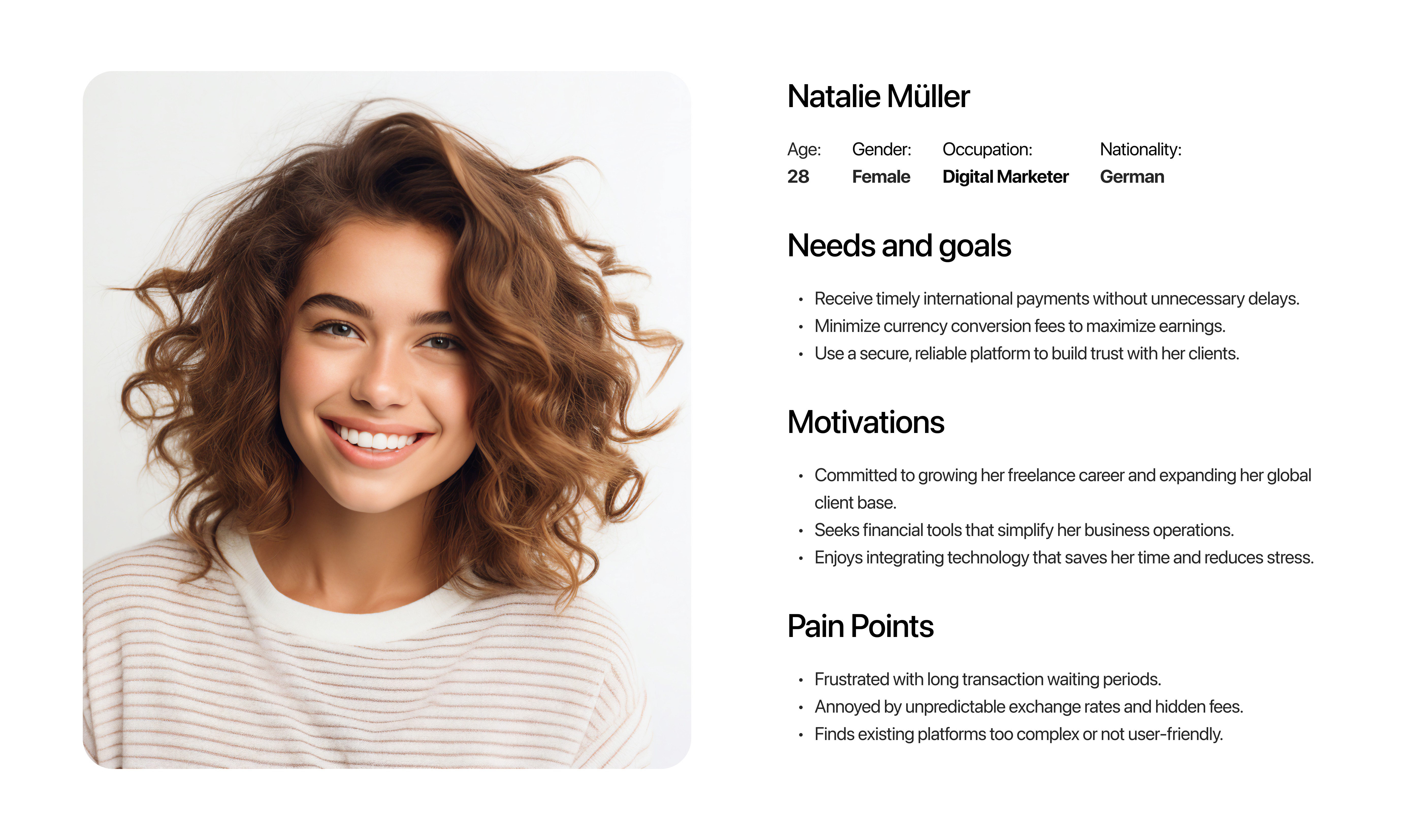
User Persona
Defining the target audience for better design decisions
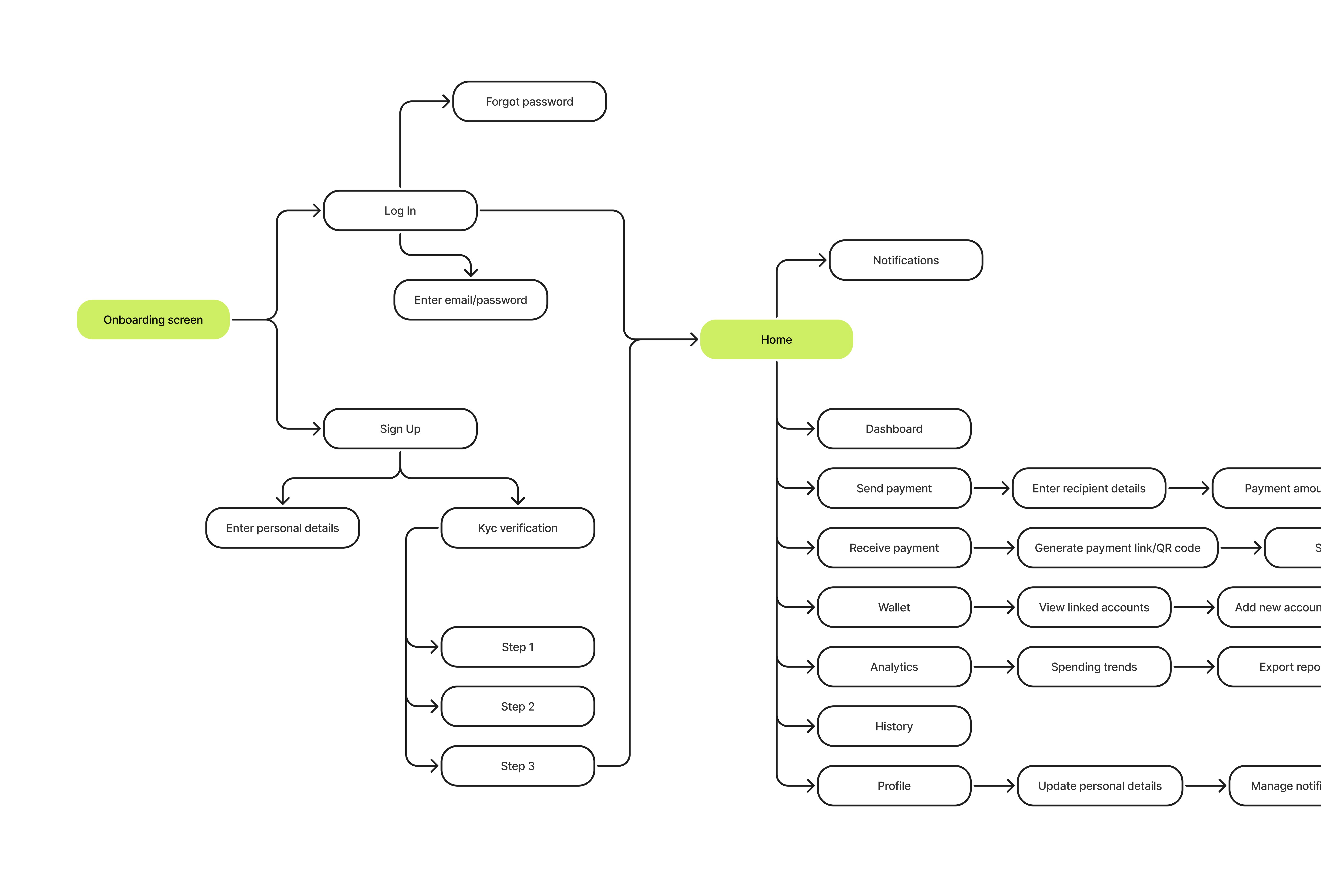
User Flow
The sequence of steps users take within the app to complete their tasks, ensuring a smooth and intuitive journey.
Result
The final design presents Paylynx as a clear and approachable fintech product, where structure and simplicity work together to support everyday financial tasks. The interface turns complex data into an understandable and calm experience, helping users feel more in control of their finances.